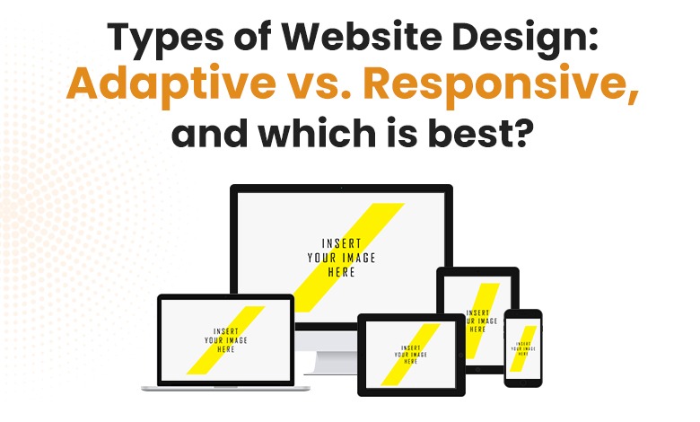
Developing new and better techniques in web design is always there in this field. In the 2000s, if you remember, we had a very text-heavy and static website. We Created only one screen size as desktop computers were there to interact with.
With so much advancement in technology, we started to see websites on little screens like tablets and smartphones. However, the technology has become more complicated, so there are many website design problems for user experience. There are two solutions for all these problems: Responsive and the other one is Adaptive design.
One of the massive debates that we’ve seen since the hike in mobiles is whether you should select to develop a responsive, adaptive web design (AWD) or have your mobile site. For the motive of this discussion, standalone is the least favorite solution of web designers and businesses.
Adaptive Website Design
Compared to Responsive web design, adaptive web design is not so well-known, but it is helpful for many sites. Above that, adaptive sites use various fixed designs that automatically pop up on analog display screens. Therefore, resizing the browser does not affect the design much.
A design is developed for the six same screen widths, covering large desktops to mobile devices. This way, the designer can develop as per the needs of the users that mostly prefer mobile devices or laptops or vice versa.
An adaptive web designer can look the best since it shows tailor-made designs for various screen sizes. However, the drawback is that this generally develops more work for the designer. However, sites that require the particular potential for mobile sites (like hospital sites requiring user-friendly appointments). An adaptive design can feel more deliberate since it needs more active outlining.
Pros
- Quicker page speeds
- The UX designer has power over every layout and develops the ideal design for each screen size. Because of the various layouts, designers can add or subtract content for the various sizes if it makes sense in that field.
For example, a hotel selects an adaptive design for its site. They know that the people coming to their hotel will look at their site on their mobile devices. The people will look for the location of your hotel or even for the facility to see whether the hotel is worth visiting for or not.
However, the user looking for the site on their laptop or desktop might look for more background details since they will be more familiar or aware of the hotel. With the help of adaptive design, you can exhibit various content on the homepage based on the screen the user is on.
Cons
- Copied content on various sites can harm your ranking in search engines.
- The design method is labor exhaustive.
Responsive Website Design
A responsive site is created on a flexible grid so that whether the user is using a desktop, tablet or mobile device, components of your site will remain persistent and line up on that grid. For example, a desktop design is generally on a 12-column grid.
A tablet will use 4-8 columns, and the mobile phone shows in a single column as screens decrease in size, the components heap on top of each other. You can think of it like water taking the shape of the container.
Pros
A single url for every page puts up many on-screen sizes ( as against adaptive design, which uses various URLs for a single page). As the technology is always swapping, this function gets in front of problems before it occurs.
- The design procedure needs less time.
- Responsive design develops steadiness across all devices, essential for a good user experience.
Why use Adaptive Design.?
Adaptive design is useful for reassembling a current site to make it more mobile-friendly. Allowing you to manage the design and create it for particular, various viewports. However, it depends on you the number of viewports you select, your company, or your overall budget.
Moreover, it also provides you with some amount of control that is unnecessary while using responsive design.
Why use Responsive Design.?
Top sites now are using Responsive web design, which has been made simpler for less experienced designers and developers. For this, all credit goes to the accessibility of themes through CMS systems like WordPress, Joomla, and Drupal. However, it does not provide much control as it is adaptive but takes much less time for Maintenance and development.
The conclusion-Adaptive vs. Responsive Design
When it comes to which design is better, you need to select that as per your audience. Selection of your design depends upon your audiences primarily. However, when you know which site they are accessing more, it becomes simpler to design by keeping in mind the layout, content and many more things.
Also, it mainly depends upon whether the site you have to work on is currently existing or you’re starting from etching. Responsive design has become the most used design, and around ⅛ websites use it. As compared to adaptive design, responsive design use is growing fastly.
By seeing the above information or details, it is better to say that responsive design is preferred over adaptive because of the continuing work necessary for adaptive design.
Despite this, if the client or company has a good budget, then the adaptive design will be the better choice for designing. They created two sites in WordPress.
The plugin distributes a mobile theme to users relative to the device they’re accessing the site from. Also, providing upgraded configuration options so that you can additionally streamline the methods.
Responsive design will remain very famous, but that might be because we have not yet got the perfect solution to the heavy preservation of that adaptive request. However, adaptive design hasn’t vanished fully, despite responsiveness. So at least in theory, possibilities are there that we’ll see some advancement appearing yet that will bluster responsive web design.
ARM Infoway provides the best website design services. We make use of both Adaptive design and responsive design as per the requirement of our customer or client.


1 Comment
Comments are closed.